How to create a simple animated and responsive navigation menu
Updated: 27-May-2022 / Tags: HTML, CSS and Javascript / Views: 1147
Introduction
Hello everyone,
In this article we are going to see how can we create a responsive navigation menu
with HTML, CSS, and a little bit of JavaScript.
Let me quick explain what we are going to create.
In the html page, we are gonna have a header with a background image, and underneath the header we are going
to have our responsive and animated navigation menu. We are going to have separate css files for the mobile
and desktop versions, and a javascript file to animate with a slide effect the nav links. That's all
If you understand how the whole responsive thing works, you can build more complex stuff, than this
navigation menu that we code in this article.
And with that being said, let's code.
Live Demo
Click on the "View Demo" button to see what we are going to code. It will help you a lot when you read the article.
Project's folder
Lets walk through the projects folder and see all the files we need.
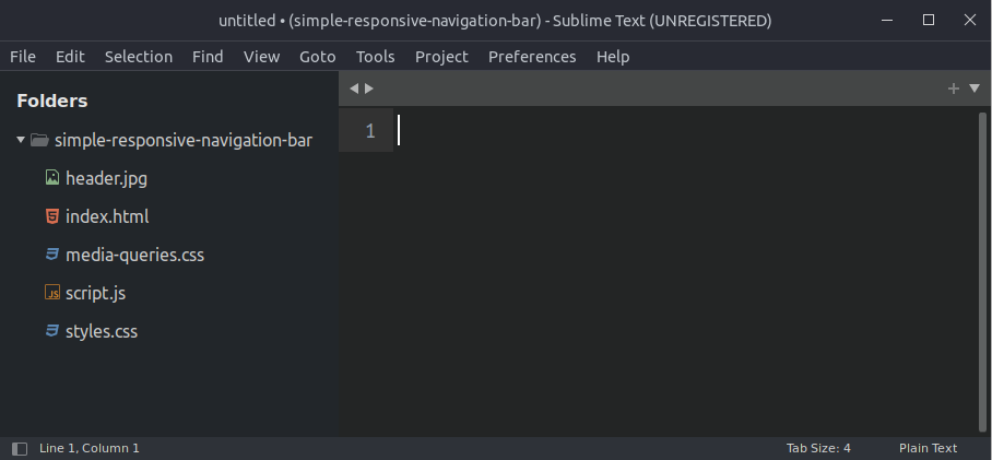
- We need an index.html file to write the html code.
- We have a styles.css stylesheet file. This is where we code the mobile version.
- We have a media-queries.css stylesheet, to write the desktop version.
- We have a javascript file named script.js
- Also we have an image that we will use as the headers background.
The index file
Let's see what we have in the index.html file.
First of all let me say that we have here a basic
html structure, with two links to the two style sheets in line 6 and 7, and a link to the javascript file
before the closing body tag in line 34.
<!DOCTYPE html>
<html lang="en">
<head>
	<meta charset="UTF-8">
	<meta name="viewport" content="width=device-width, initial-scale=1.0">
	 <link rel="stylesheet" href="styles.css">
	 <link rel="stylesheet" href="media-queries.css">
	<title>Simple responsive navigation bar</title>
</head>
<body>
	<!-- The header section  -->
	<div class="header">
	</div>

	<!-- The navigation menu  -->
	<div class="nav-wrap">
		<nav>
			<div class="logo">Digital Fox</div>

			<div class="links">
				<a href="">Home</a>
				<a href="">PHP</a>
				<a href="">javascript</a>
				<a href="">html/css</a>
				<a href="">web design</a>
				<a href="">about</a>
				<a href="">contact</a>
			</div>

			<div class="icon">☰</div>
		</nav>
	</div>

	<script src="script.js"></script>
</body>
</html>
Content breakdown
- In line 12 we have the header element. The header element is empty we will assign a background image from the css file.
- In line 16 we have the navigation. We have a div element which wraps all the nav element's html code.
-
Let's breakdown the nav element. The nav element is divided in three sections. In the first section we have
the website's logo in line 18. In line 20 we have the second section where we have all the a tags.
And in the third section we have the "hamburger" menu icon.
This structure will help me a lot to achieve the responsiveness that i want for my nav menu.<nav> <div class="logo">Digital Fox</div> <div class="links"> <a href="">Home</a> <a href="">PHP</a> <a href="">javascript</a> <a href="">html/css</a> <a href="">web design</a> <a href="">about</a> <a href="">contact</a> </div> <div class="icon">☰</div> </nav>
Lets move to the css file.
The CSS file
Let's analyze the css rules that are responsible for the mobile layout in the styles.css file.
*{
	margin: 0;
	padding: 0;
	box-sizing: border-box;
}

body{
	font-family: sans-serif;
	min-height: 100%;
	color: #555;
}

.header{
	width:  100%;
	height: 300px;
	background-image: url("header.jpg");
	background-position: center;
	background-repeat: no-repeat;
	background-size: cover;
}

.nav-wrap{
	width:  100%;
	box-shadow: 0 5px 5px rgba(0,0,0,0.15);
	background-color: #fff;
}

nav{
	display:  grid;
	grid-template-columns: auto 1fr;
	grid-column-gap: 30px;
	grid-template-rows: 60px;
	align-items: center;
	position: relative;
}

.logo{
	font-size: 24px;
	padding-left: 20px;
	font-weight: bold;
	color: #227faf;
}

.links{
	width:  100%;
	position: absolute;
	top: 60px;
	background-color: #4e6696;
	box-shadow: 0 5px 15px rgba(0, 0, 0, 0.4);
	max-height: 0;
	overflow: hidden;
	transition: max-height 0.3s;
}

.links a{
	color: #fff;
	text-decoration: none;
	display: block;
	padding: 15px 25px;
	border-bottom: thin dotted #728aba;
	text-transform: uppercase;
	transition: background-color 0.3s, color 0.3s;
}

.links a:hover, .links a.active{
	background-color: #7396dd;
}

nav .icon{
	justify-self: end;
	font-size: 24px;
	padding-right: 20px;
	cursor: pointer;
}
CSS breakdown
-
We starting our css code by resetting all html elements. We are setting every element's margin and padding to zero.
And we set the value of the box-sizing property to border-box. That means that i will have total control in my
design.
The border-box value tells the browser not to change the elements dimensions when we add padding to it.*{ margin: 0; padding: 0; box-sizing: border-box; } -
Next we are setting some basic properties to the body element. The values in the body rule will affect
most of the elements in our html code.
body{ font-family: sans-serif; min-height: 100%; color: #555; } -
Next we are targeting the nav-wrap container and set the width to 100%. The background color to white. And we add
a drop shadow to make things pretty.
.nav-wrap{ width: 100%; box-shadow: 0 5px 5px rgba(0,0,0,0.15); background-color: #fff; } -
Next we are targeting the header.
.header{ width: 100%; height: 300px; background-image: url("header.jpg"); background-position: center; background-repeat: no-repeat; background-size: cover; }- We are setting the width to 100% and the mobile height to 300 pixels, in line 2 and 3.
- In line 4 we target the image in our folder and set it as a background.
- We center the image in line 17 and tell the browser to not repeat the image in line 18 because the image that i use is large enough to cover large screens.
- The cover value in line 19 tells the browser to crop and fit the image in the container.
-
Next we have our nav element.
nav{ display: grid; grid-template-columns: auto 1fr; grid-column-gap: 30px; grid-template-rows: 60px; align-items: center; position: relative; }-
Line 29, we display the nav element as grid, that means we can divide the element into rows and columns.
In line 30 we divide the nav element in two columns, we set the first column to auto, that means that the width of the column will match the width of the content. And the second column to one fraction "1fr" which means that the second column will span the remaining space. -
In line 31 we set a margin between the columns
-
In line 32 we set the height of the nav element to 60px.
-
In line 33 we center vertically the content, not the columns, but the content inside the columns.
- And in line 34 we set the position of the nav element to relative.
-
Line 29, we display the nav element as grid, that means we can divide the element into rows and columns.
-
Next we are styling the logo. Nothing important here.
.logo{ font-size: 24px; padding-left: 20px; font-weight: bold; } -
Next we have the links container. That's where all of our a tags are.
.links{ width: 100%; position: absolute; top: 60px; background-color: #4e6696; box-shadow: 0 5px 15px rgba(0, 0, 0, 0.4); max-height: 0; overflow: hidden; transition: max-height 0.3s; }- In line 45 we are setting the width to 100%.
- In line 46 and 47 we move the links container under the nav element.
- In line 50 and 51 we are setting the max-height to zero and the overflow property to hidden. This will hide the links container. We are going to change the max-height property in the javascript file and make the links visible when we click on the menu icon.
- And in line 52 we are adding a transition effect so we have the slide animation.
-
Next we are targeting all the a tags in the links container.
.links a{ color: #fff; text-decoration: none; display: block; padding: 15px 25px; border-bottom: thin dotted #728aba; text-transform: uppercase; transition: background-color 0.3s, color 0.3s; }- The important thing here is that we display the a tags as block elements in line 58, doing so we stack them on top of each other. Everything else is to make things pretty.
-
Next we change the background of the anchor tags on hover and on active state.
.links a:hover, .links a.active{ background-color: #7396dd; } -
And last we push the icon to the right, make it bigger and give it some space from the right border of the browser.
nav .icon{
	justify-self: end;
	font-size: 24px;
	padding-right: 20px;
	cursor: pointer;
}
The media queries file
In the media-queries.css file we are going to write the css code for the desktop version.
We are going to set the min-width break point to 1050 pixels.
That means that all the rules are going to affect the elements when the browser window is wider than 1050px.
@media screen and (min-width: 1050px){
	.header{
		height:  400px;
	}

	nav .icon{
		display: none;
	}

	.links{
		position: relative;
		top:  0;
		background-color: #fff;
		max-height: inherit;
		box-shadow: none;
	}

	.links a{
		display: inline-block;
		border-bottom: none;
		border-width: 0;
		font-weight: 500;
		padding: 10px 20px;
		border-radius: 3px;
		color: #555;
	}

	.links a:hover{
		color: #fff;
	}

	nav{
		max-width: 1000px;
		margin: 0 auto;
	}
}
Code breakdown
-
We are going to make the header a little big taller.
.header{ height: 400px; } -
We are going to set the max-width of our nav element to 1000 pixels and center it on the page.
nav{ max-width: 1000px; margin: 0 auto; } -
We are going to put the links container back to the nav element and it's natural
position. We achieve that by reordering the element with the position property set to relative,
and the top property set to zero.
.links{ position: relative; top: 0; background-color: #fff; max-height: inherit; box-shadow: none; } -
Next we have to make some changes to the a tags. The important property here is the display property that we are setting
to inline-block, so we can display the a tags next to each other.
.links a{ display: inline-block; border-bottom: none; border-width: 0; font-weight: 500; padding: 10px 20px; border-radius: 3px; color: #555; } -
And last we change the a tags color on hover, and hide the menu icon. We don't need the menu icon on the
large screen.
.links a:hover{
	color: #fff;
}
nav .icon{
	display: none;
}
The JavaSript file
And last we have the javascript file, where we are going to make the menu visible on the mobile version.
let icon = document.querySelector(".icon");
let links = document.querySelector(".links");

icon.onclick = function(){
	if(links.style.maxHeight == 0){
		links.style.maxHeight = links.scrollHeight + "px";
	}else{
		links.style.maxHeight = "";
	}
}
Code breakdown
- In line 1 and 2 we accessing the icon element and the links container.
- In line 4 we assign an onclick event-listener on the menu icon, so every time someone clicks on the icon a function will run.
- In line 5 we check with an if statement if the maxHeight css property is equal to zero. If this is true then in line 6 we use the scrollHeight property to get the actual size of the links container and assign it to the maxHeight property. This will make the links container visible.
- Else in line 8 we set the maxHeight property to its initial value.
- And that's it, that is all the code we need to make the navigation menu responsive and apply an animated slide toggle effect.
Summary
And that's it. We saw how to create an animated and responsive navigation menu.
Source code
Download the source code for free.
Times downloaded: 91
Buy me a coffee
Great Udemy Courses
 2025 ChatGPT Complete Guide: Learn Midjourney, ChatGPT 4 & More
ChatGPT Plugins + 25 Powerful AI Tools 10x Your Productivity & Creativity | ChatGPT, Generative AI, Prompt Engineering
 The Complete Full-Stack Web Development Bootcamp 2025
Become a Full-Stack Web Developer with just ONE course. HTML, CSS, Javascript, Node, React, PostgreSQL, Web3 and DApps
 Complete Modern PHP Developer Course in 2024
The modern PHP course with a project, challenges and theory. Includes SQL and MVC Framework. Get started with PHP 8!
 The Complete JavaScript Course 2025: From Zero to Expert!
Master Python by building 100 projects in 100 days. Learn data science, automation, build websites, games and apps!
 100 Days of Code: The Complete Python Pro Bootcamp
Master Python by building 100 projects in 100 days. Learn data science, automation, build websites, games and apps!
Created By Digitalfox
 Responsive navigation with working login system using PHP Mysql and Ajax
Responsive navigation menu that integrates a secure login and register system, with a forgot password action, and a contact form.
The whole system is animated in slide-in sidebars and shows up on the right side of the web-design.
Comment section
You can leave a comment, it will help me a lot.
Or you can just say hi. 😉